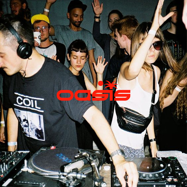
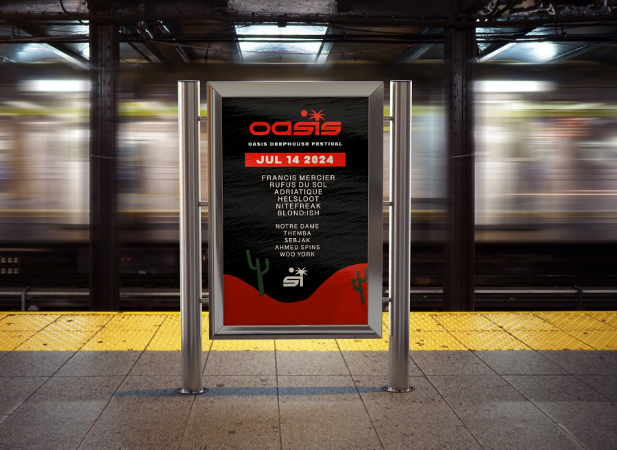
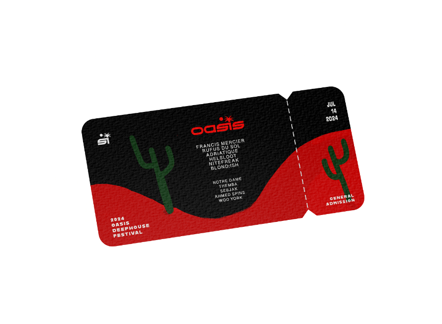
Oasis Festival Branding
The idea behind this is to create a music festival where people can come to enjoy music.
It’s based on the concept of water. Music is like water, it creates energy, it sends vibrations through
the
air and into our ears sparking a reaction through a crowd. It creates movement therefore creating
another chain reaction of energy.
I wanted this music festival to celebrate energy especially celebrating one of our very precious earth
elements: water.
Being in a crowd dancing to the sound of music is like floating down a river. Each beat, melody & and
rhythm moves you like a puppet on strings. It is therapeutic and cleanses you.
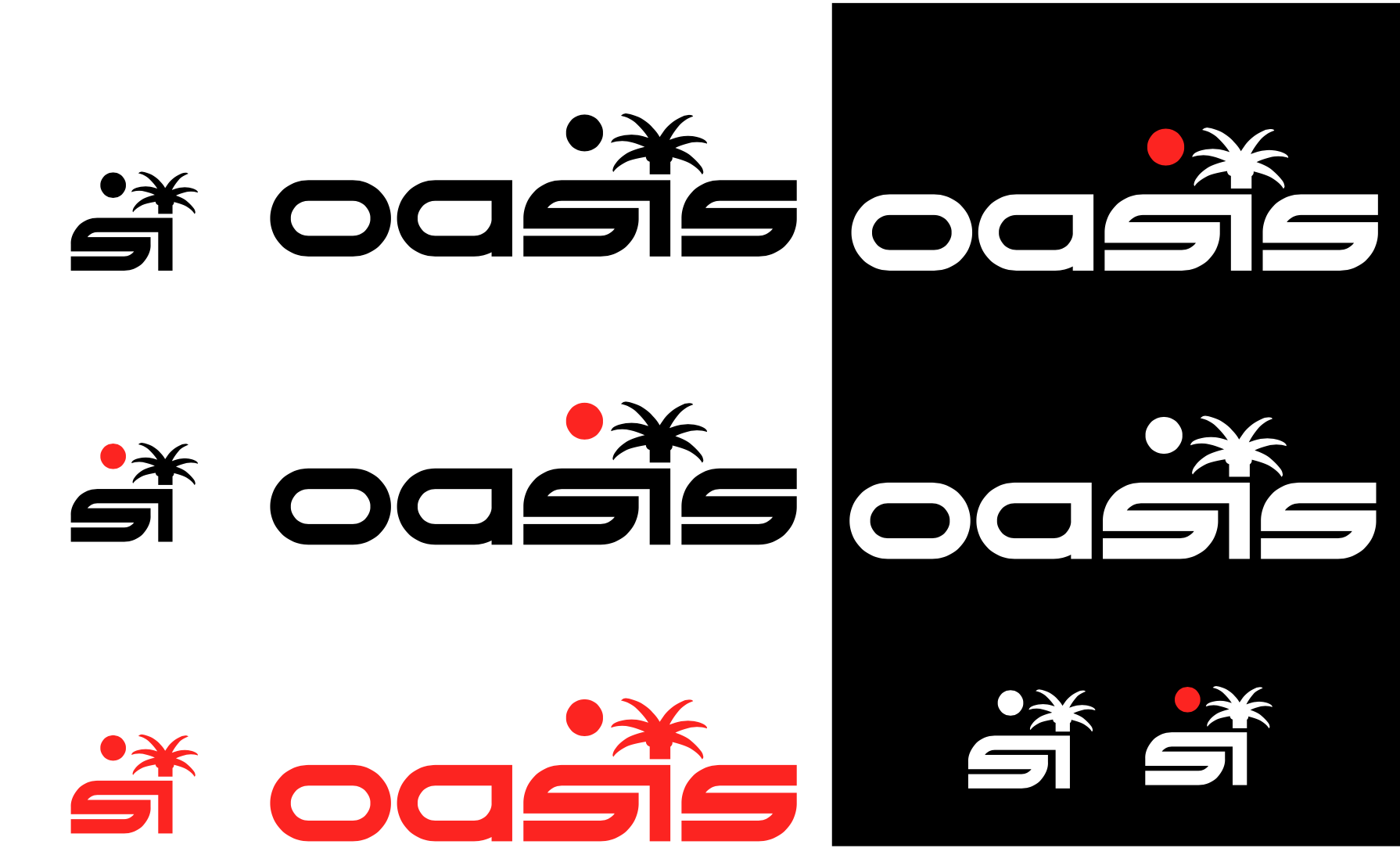
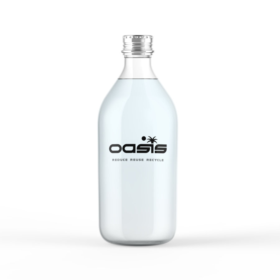
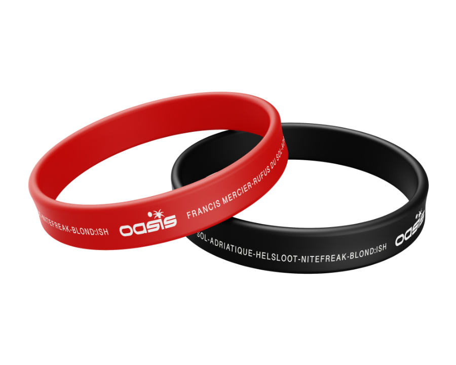
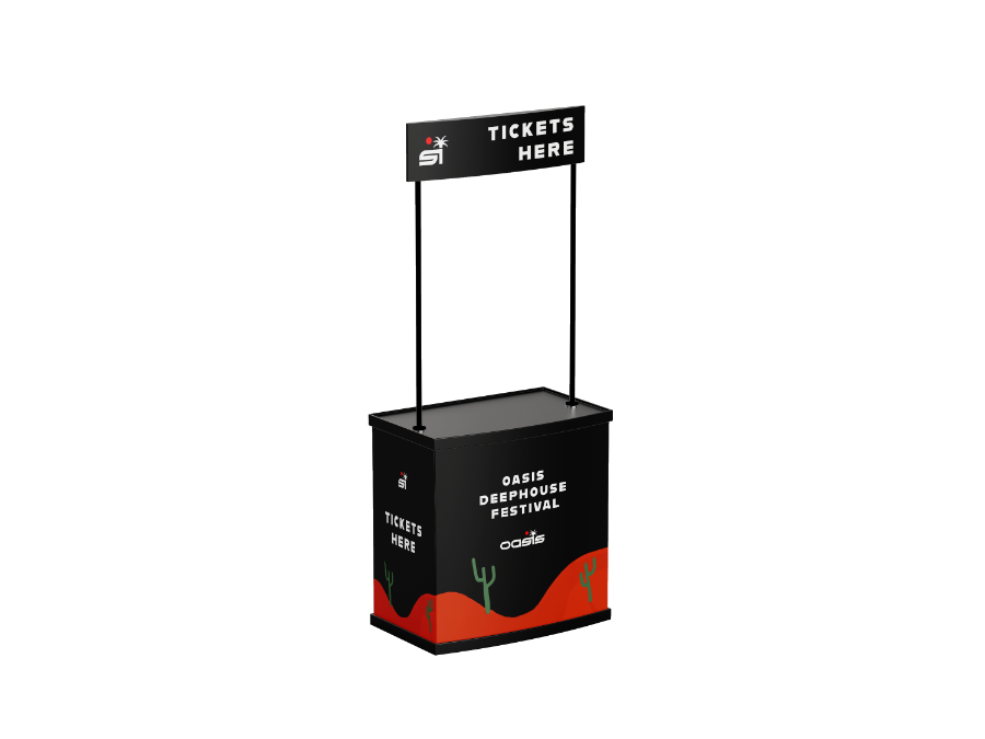
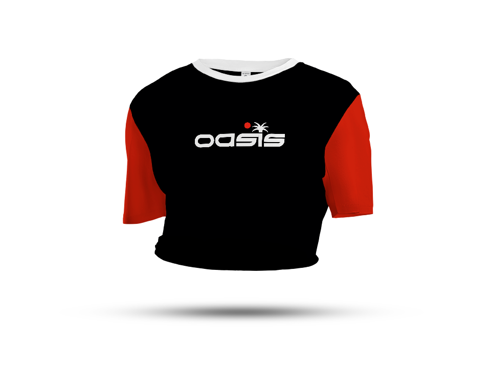
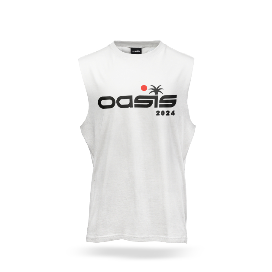
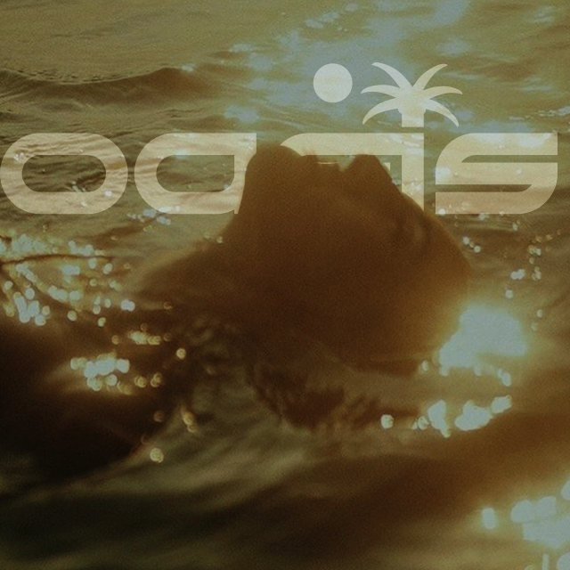
I created different usable logos for different uses. The logo itself consists of different elements that help support the final concept in a modern and innovative way. The letter S looks like a wave so I thought that would be the perfect option to opt to. The circle above represents the sun and to the right is a palm tree which is connected to the wave to symbolize a sunset on the water in the horizon.
I created different usable logos for different uses. The logo itself consists of different elements that help support the final concept in a modern and innovative way. The letter S looks like a wave so I thought that would be the perfect option to opt to. The circle above represents the sun and to the right is a palm tree which is connected to the wave to symbolize a sunset on the water in the horizon.