Card Game
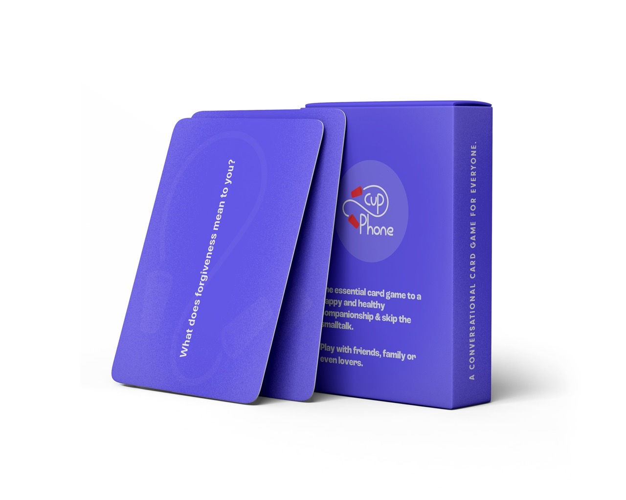
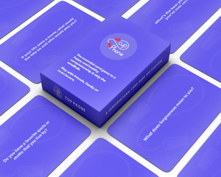
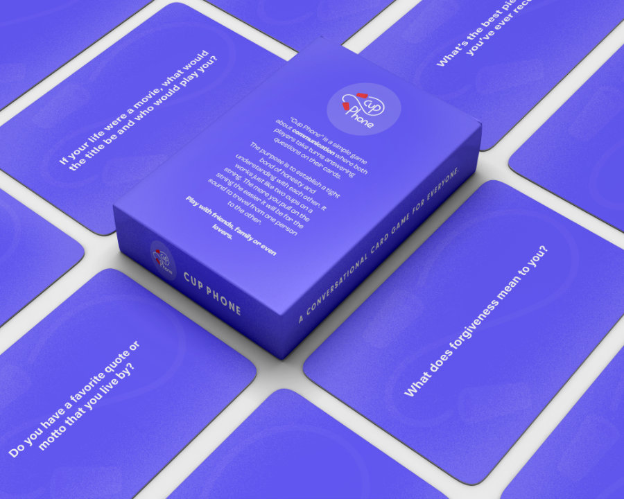
Designing a card game to spark interesting conversations with friends and family.
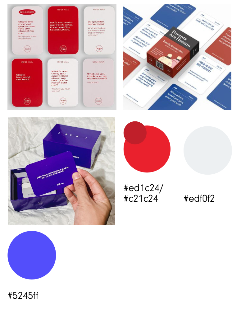
When considering the mood board and color pallet I looked at other successful card game brands and I
noticed
that each game usually uses colors that are cooler tones or black and others bright red. So when
deciding my
color pallet I used other successful card games as an inspiration for my card game.
From that information I started my design process where I looked for different color palette styles and
I
found that a neon purple fits perfectly for my target audience. Most people who purchase the game are
already in their 20s and they look to have meaningful conversations with their family, friends, and
significant others.
